Sunday, August 12, 2007

Assignment - My self-portrait

Photo Sharing and Video Hosting at Photobucket

This is myself portrait created for assignment 2A. When I finished it, I was surprised to find more similarity of this picture to me than what I planned at the beginning. I also think it look like me (even though everyone say they cannot recognize me anymore...)
I don't like taking picture of myself and really dislike staring at my image on the screen. that's why it took me quite a lot of time to get used to it. I found it easier to continue when I didn't see the real part of my face anymore. I thought a lot at first, but half way I was kind of having fun and just do what I feel like more than doing it on purpose, and I actually had fun.
This image is done by manipulating my own picture in photoshop and the outline shape of me is still kept. I chose some of the part I found most distinctive of me to represent. Many part of it is easily to recognize if you know me, just some part is what I don't express it outside as long as there is someone else with me. My glasses the only thing expressed my hobby. I love programming and coding, high tech and mechanical things. I sure pay attention to them and only feel interest in doing sth related to them, so I think that's an important interest of mine.

Sunday, July 29, 2007

Motion typography advert

The words "motion typography" caught my attention when I was going around youtube as usual. After two lesson about typography in class, I'm kind of interested in how people use typography in many diffrent things besides big title.
This advetisement is really simple yet I took a liking to it very fast. It reminds me of a lot of ads I saw on TV all these time, but I didn't really pay attention to how they use the types.


This ad is quite short (30s) but the information it provide is effecient. The text is always in motion but we have enough time to read and understand them. I found the transition of text is nice, eventhough text some time is tilted, there is always some straight line for us to see alignment and read easier. They use very simple fonts and combine capital with lower case to suit the important level of the text. The most important information is displayed longer too.

Lord of the rings practice

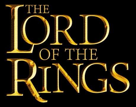
This is my result of Lord of the rings title, I couldn't find any font that is similar enough to the font used in original logo (Basicly, I can't find font that match both the letter "O" and letter "G"). Therefore I had to edit the text a lot. I laid and edited the text in Illustrator, then export to psd file to add some decoration to the title in photoshop (the metal and grungy feeling).
The font I chose for this is called Minion Pro (the hairline in this font is thinner than the font in orginal logo, the "S" is taller and the "G" has more serif. I changed them a bit in Illustrator)

Photo Sharing and Video Hosting at Photobucket
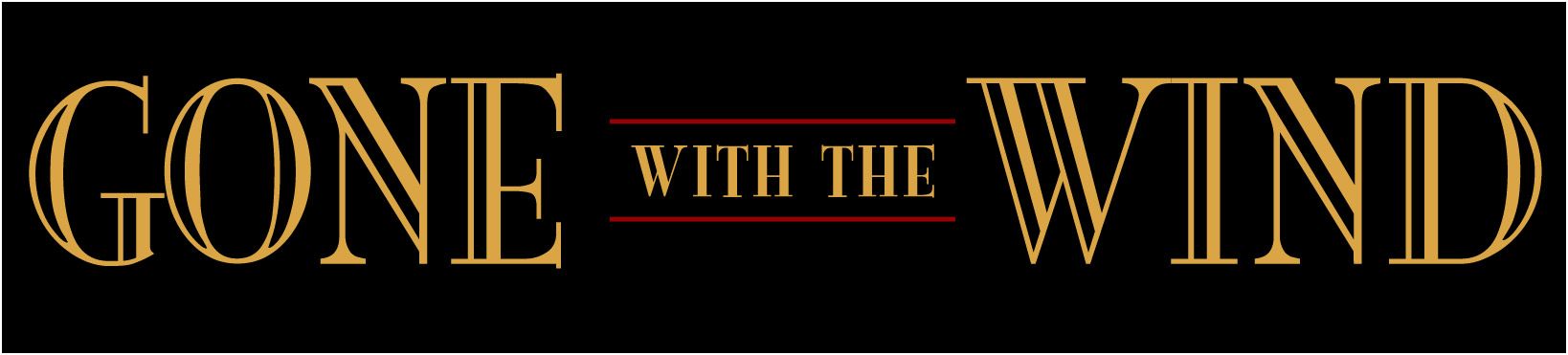
I also try to make the "Gone with the wind" title. The font is really hard to identify and I couldn't find any font similar to the font used in the film poster. I decided to try a font available in my PC called Mona Lisa ITC-normal because its decoration is a little bit like the font in poster.

Photo Sharing and Video Hosting at Photobucket
After this homework, I can really see that even a very little difference in two fonts, if we used one to replace another, it still feel not right.

Sunday, July 22, 2007

Vector & Brush resourse site

I just found 2 sites with free resource for design.

1) Free Brushes : this sites has quite a collection of brushes, from grungy, vector to sparkle. Many brushed there is very nice and can be useful in design. Most importantly, it's free.


2) Free Vectors: vector packs isn't easy to find, so I was happy to bum into this site. Many cool vectors (not as many as brushes but still a lot)

I'm pretty much interested in vectors cause I just can't make them in Illustrator. I wonder if these vectors can only be made by drawing or there is other ways. From Maddy tutorial last Friday, I at least know how to make silhouettes of people. However, what I'm most curious about is the vector floral decoration.

Web design - Online job agency

Photo Sharing and Video Hosting at Photobucket
I'm making a layout for Web Programming course, an online job agency website. There are still some problem with alignment caused by different browser and they're giving me a headache.
After I submit this layout, a senior student (who's in internship right now) gave me some comments about it.
1) She thinks I used too many colors (it should be less than 3 colors besides black & white). I have aqua, red and orange, which is pretty many. With a simple website like this, we don't need many color to distinguise sections.
=> I'm thinking about it and trying to reduce number of colors in my page. Probably I can omit red in the title, and change it to aqua.
2) "I don't like the thin gray line on the left column, it distracts my eyes"
=> Maybe because i'm the one who make it, I didn't realize the problem. That line suppose to be a shadow but it seems like I didn't do it right, look a bit not like shadow any more. Using simple drop shadow maybe a better idea.
3) In IE6, she detected another layout problem because of browser, but I don't have IE6 and cannot test it, this is dangerous.
Because she got power-off, we didn't discuss anymore problems. I'll have to fix this many times for later assignment.

Sunday, July 15, 2007

Video - Chinese Painting and Calligraphy in 3D

This video really interested me when I first watched it (probably because I don't have much knowledge about 3D, so I found this rather new to me)
What I like about this video is that people can use 3D (which I think full of calculation, usually create mechanical or industrial look) to make something look completely 2D and organic. As we can see, the feeling of Chinese traditional painting is all created by the quality of lines, they are organic and humanistic. The texture and color is those of old paper, which I think greatly contributing to its painting look.
Finally, I like it because I've always been fan of Chinese and Japanese art.

Gestalt Exercise

This is my exercise on practicing Gestalt concept.

Photo Sharing and Video Hosting at Photobucket

The first one I did, I tried to achieve continuance by arranging the text running along the edge (but I'm not sure if this can be continuance). Another thing is proximity with groups of text in different size and colors. I think the color scheme of this image is split complimentary (red + orange on green background), but I break it a bit when I use yellow on the small text.

Photo Sharing and Video Hosting at Photobucket

I tried a second one to practice closure. Maddy help me with this a little bit in class (same concept but with another picture, I change it when I got home) There is only yellow (dark, and almost be orange) and dark orange so this color scheme can even be monochromatic (it maybe analogous though)