Sunday, September 16, 2007

Title sequence - Princess Raccoon

I've posted the link to http://www.submarinechannel.com/ once for the Elephant Tales title sequence but I want to introduce this link again for another title sequence I found later. As a fan of Japanese culture, I took a liking to this title pretty fast, but I don't really know how to describe this piece well, so I'll borrow their introduction:


Princess Raccoon
"The contemporary and the traditional merge in this beautiful, multi-layered title sequence. The title sequence consists of several side-scrolling overlapping layers with animated, static and abstract visual elements that contain a lot of Japanese cultural references." (from submarine)

I was amazed by the way the layers are put on top each other without any blending, the cuts are just straight and show clear differences. While the content of of the picture are all traditional drawing, the way they're merged is like the way in contemporary art. I think this combination is quite new and unique.

Forget the film, watch the titles

That's the header of www.submarinechannel.com. There's a collection of many title sequence in their site. They're quite modern and interesting. I've watched some of them and I really like the Elephant Tales title. The forest and african music is very cheerful and the graphic is nice. The whole peice is unified with the natural organic drawing, which goes very well with the funky font too. What I like the most is the shape of animal moving with dictintive background.


Watch the video in their site and other title sequence too.
They're great and fun to watch.
LINK:
http://www.submarinechannel.com/titlesequences/video.jsp?video=27052

Sunday, September 9, 2007

Font advertisement - ITC Founder Caslon

Another assignment here, an advertisement for a font. This is the first time I create a flash piece with classical music and it was hard to get used to the slow speed, I think. What I found most interesting about this assignment is that I had a chance to read lots of infoamtion about an old and famous font, knowing about its variation and their own charm, and the little but important difference of each variations. However, those difference made a lot of difficulty for me to choose a specific one to work with. I spent most of the time researching and finding images.


My safe sex poster

Photo Sharing and Video Hosting at Photobucket
This is the poster I did for my assignment, I've changed a little from the original based on the comment of Maddy. This poster aims at young girls who, because of love, think they don't need to request their lover to wear condoms. The purpose of this poster is to change their way of thinking and change the image of condoms, from sth related to HIV to a kind of love symbol. I used condoms to arrange the heart to say that condoms can be love (both in appearance and thought)

Sunday, August 26, 2007

Type in Motion - Introduction flash

I found this flash with some brief introduction about type in motion, there are some terminologies with examples that I think will be helpful if we want to research more about the topic.

STRETCH Conference 2004, STEP Inside Design
Workshop Presenter: Lara McCormick lara@expression.edu
Program Director, Digital Graphic Design
Expression College for Digital Arts

Type in Motion Presentation (Flash)


Source: http://simplynifty.com/stretch/

Sunday, August 12, 2007

french stop aids posters

Photo Sharing and Video Hosting at Photobucket


I once used these posters for the presentation about metaphor in DIM1, and I think they are impressive. They use photograph of people in sexual acts with partners that are ... poisonous insects. The posters make me shiver when I first saw them, but I think that because they're shoking or scary, they left greater impression. They convey the idea of danger in non-safe sex in a very straight forward way and actually make people feel that danger. I've nerver forgotten them since I saw them 2 semester ago. When I listened to Maddy lecture about safe sex posters, I immediately remembered these two.

Because they use photograph, it's easy to make people to pay attention. The campaign came with 2 posters, to aims to both men and women, the target audience is very clear in these poster too. The line of small text at the bottom right (in French naturally) translates into:
“without a condom, you’re making love to AIDS. Protect yourself”

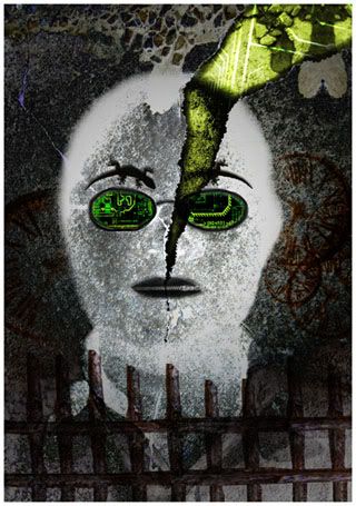
Assignment - My self-portrait

Photo Sharing and Video Hosting at Photobucket

This is myself portrait created for assignment 2A. When I finished it, I was surprised to find more similarity of this picture to me than what I planned at the beginning. I also think it look like me (even though everyone say they cannot recognize me anymore...)
I don't like taking picture of myself and really dislike staring at my image on the screen. that's why it took me quite a lot of time to get used to it. I found it easier to continue when I didn't see the real part of my face anymore. I thought a lot at first, but half way I was kind of having fun and just do what I feel like more than doing it on purpose, and I actually had fun.
This image is done by manipulating my own picture in photoshop and the outline shape of me is still kept. I chose some of the part I found most distinctive of me to represent. Many part of it is easily to recognize if you know me, just some part is what I don't express it outside as long as there is someone else with me. My glasses the only thing expressed my hobby. I love programming and coding, high tech and mechanical things. I sure pay attention to them and only feel interest in doing sth related to them, so I think that's an important interest of mine.