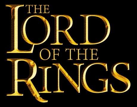
This is my result of Lord of the rings title, I couldn't find any font that is similar enough to the font used in original logo (Basicly, I can't find font that match both the letter "O" and letter "G"). Therefore I had to edit the text a lot. I laid and edited the text in Illustrator, then export to psd file to add some decoration to the title in photoshop (the metal and grungy feeling).
The font I chose for this is called Minion Pro (the hairline in this font is thinner than the font in orginal logo, the "S" is taller and the "G" has more serif. I changed them a bit in Illustrator)
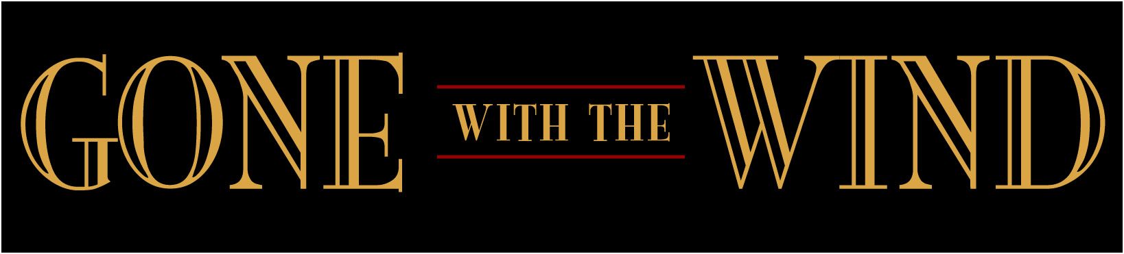
I also try to make the "Gone with the wind" title. The font is really hard to identify and I couldn't find any font similar to the font used in the film poster. I decided to try a font available in my PC called Mona Lisa ITC-normal because its decoration is a little bit like the font in poster.
After this homework, I can really see that even a very little difference in two fonts, if we used one to replace another, it still feel not right.
No comments:
Post a Comment