Monday, September 17, 2007

Final assignment

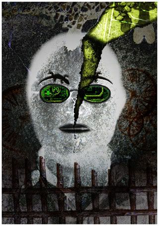
This is my final assigment, the title sequence for Carnival of Souls movie.
The hardest part to make this flash is synchronizing music and animation. I've done this before with video, but flash is really much more difficult, there is no audio timeline because I add it in sound object layer. Everytime I wanted to check a scene, I had to watch from the beginning, too much that I've got sick of watching it again. However, I'm quite please with the result.
I either drew the pictures or capture them from the movie (use captured image to try the oncept in SEVEN ^^)
Finally, this is the flash. (I did embed the flash to view online, but I found out that the visual run slower and it cannot match the music, so I took it down. Please download and watch it on your computer, NOT online - maybe 24 frames/s isn't suitable for online viewing after all ^^")
http://unix.rmit.edu.vn/~s3153665/s3153665_A3.swf

Sunday, September 16, 2007

Title sequence - Princess Raccoon

I've posted the link to http://www.submarinechannel.com/ once for the Elephant Tales title sequence but I want to introduce this link again for another title sequence I found later. As a fan of Japanese culture, I took a liking to this title pretty fast, but I don't really know how to describe this piece well, so I'll borrow their introduction:


Princess Raccoon
"The contemporary and the traditional merge in this beautiful, multi-layered title sequence. The title sequence consists of several side-scrolling overlapping layers with animated, static and abstract visual elements that contain a lot of Japanese cultural references." (from submarine)

I was amazed by the way the layers are put on top each other without any blending, the cuts are just straight and show clear differences. While the content of of the picture are all traditional drawing, the way they're merged is like the way in contemporary art. I think this combination is quite new and unique.

Forget the film, watch the titles

That's the header of www.submarinechannel.com. There's a collection of many title sequence in their site. They're quite modern and interesting. I've watched some of them and I really like the Elephant Tales title. The forest and african music is very cheerful and the graphic is nice. The whole peice is unified with the natural organic drawing, which goes very well with the funky font too. What I like the most is the shape of animal moving with dictintive background.


Watch the video in their site and other title sequence too.
They're great and fun to watch.
LINK:
http://www.submarinechannel.com/titlesequences/video.jsp?video=27052

Sunday, September 9, 2007

Font advertisement - ITC Founder Caslon

Another assignment here, an advertisement for a font. This is the first time I create a flash piece with classical music and it was hard to get used to the slow speed, I think. What I found most interesting about this assignment is that I had a chance to read lots of infoamtion about an old and famous font, knowing about its variation and their own charm, and the little but important difference of each variations. However, those difference made a lot of difficulty for me to choose a specific one to work with. I spent most of the time researching and finding images.


My safe sex poster

Photo Sharing and Video Hosting at Photobucket
This is the poster I did for my assignment, I've changed a little from the original based on the comment of Maddy. This poster aims at young girls who, because of love, think they don't need to request their lover to wear condoms. The purpose of this poster is to change their way of thinking and change the image of condoms, from sth related to HIV to a kind of love symbol. I used condoms to arrange the heart to say that condoms can be love (both in appearance and thought)

Sunday, August 26, 2007

Type in Motion - Introduction flash

I found this flash with some brief introduction about type in motion, there are some terminologies with examples that I think will be helpful if we want to research more about the topic.

STRETCH Conference 2004, STEP Inside Design
Workshop Presenter: Lara McCormick lara@expression.edu
Program Director, Digital Graphic Design
Expression College for Digital Arts

Type in Motion Presentation (Flash)


Source: http://simplynifty.com/stretch/

Sunday, August 12, 2007

french stop aids posters

Photo Sharing and Video Hosting at Photobucket


I once used these posters for the presentation about metaphor in DIM1, and I think they are impressive. They use photograph of people in sexual acts with partners that are ... poisonous insects. The posters make me shiver when I first saw them, but I think that because they're shoking or scary, they left greater impression. They convey the idea of danger in non-safe sex in a very straight forward way and actually make people feel that danger. I've nerver forgotten them since I saw them 2 semester ago. When I listened to Maddy lecture about safe sex posters, I immediately remembered these two.

Because they use photograph, it's easy to make people to pay attention. The campaign came with 2 posters, to aims to both men and women, the target audience is very clear in these poster too. The line of small text at the bottom right (in French naturally) translates into:
“without a condom, you’re making love to AIDS. Protect yourself”

Assignment - My self-portrait

Photo Sharing and Video Hosting at Photobucket

This is myself portrait created for assignment 2A. When I finished it, I was surprised to find more similarity of this picture to me than what I planned at the beginning. I also think it look like me (even though everyone say they cannot recognize me anymore...)
I don't like taking picture of myself and really dislike staring at my image on the screen. that's why it took me quite a lot of time to get used to it. I found it easier to continue when I didn't see the real part of my face anymore. I thought a lot at first, but half way I was kind of having fun and just do what I feel like more than doing it on purpose, and I actually had fun.
This image is done by manipulating my own picture in photoshop and the outline shape of me is still kept. I chose some of the part I found most distinctive of me to represent. Many part of it is easily to recognize if you know me, just some part is what I don't express it outside as long as there is someone else with me. My glasses the only thing expressed my hobby. I love programming and coding, high tech and mechanical things. I sure pay attention to them and only feel interest in doing sth related to them, so I think that's an important interest of mine.

Sunday, July 29, 2007

Motion typography advert

The words "motion typography" caught my attention when I was going around youtube as usual. After two lesson about typography in class, I'm kind of interested in how people use typography in many diffrent things besides big title.
This advetisement is really simple yet I took a liking to it very fast. It reminds me of a lot of ads I saw on TV all these time, but I didn't really pay attention to how they use the types.


This ad is quite short (30s) but the information it provide is effecient. The text is always in motion but we have enough time to read and understand them. I found the transition of text is nice, eventhough text some time is tilted, there is always some straight line for us to see alignment and read easier. They use very simple fonts and combine capital with lower case to suit the important level of the text. The most important information is displayed longer too.

Lord of the rings practice

This is my result of Lord of the rings title, I couldn't find any font that is similar enough to the font used in original logo (Basicly, I can't find font that match both the letter "O" and letter "G"). Therefore I had to edit the text a lot. I laid and edited the text in Illustrator, then export to psd file to add some decoration to the title in photoshop (the metal and grungy feeling).
The font I chose for this is called Minion Pro (the hairline in this font is thinner than the font in orginal logo, the "S" is taller and the "G" has more serif. I changed them a bit in Illustrator)

Photo Sharing and Video Hosting at Photobucket
I also try to make the "Gone with the wind" title. The font is really hard to identify and I couldn't find any font similar to the font used in the film poster. I decided to try a font available in my PC called Mona Lisa ITC-normal because its decoration is a little bit like the font in poster.

Photo Sharing and Video Hosting at Photobucket
After this homework, I can really see that even a very little difference in two fonts, if we used one to replace another, it still feel not right.

Sunday, July 22, 2007

Vector & Brush resourse site

I just found 2 sites with free resource for design.

1) Free Brushes : this sites has quite a collection of brushes, from grungy, vector to sparkle. Many brushed there is very nice and can be useful in design. Most importantly, it's free.


2) Free Vectors: vector packs isn't easy to find, so I was happy to bum into this site. Many cool vectors (not as many as brushes but still a lot)

I'm pretty much interested in vectors cause I just can't make them in Illustrator. I wonder if these vectors can only be made by drawing or there is other ways. From Maddy tutorial last Friday, I at least know how to make silhouettes of people. However, what I'm most curious about is the vector floral decoration.

Web design - Online job agency

Photo Sharing and Video Hosting at Photobucket
I'm making a layout for Web Programming course, an online job agency website. There are still some problem with alignment caused by different browser and they're giving me a headache.
After I submit this layout, a senior student (who's in internship right now) gave me some comments about it.
1) She thinks I used too many colors (it should be less than 3 colors besides black & white). I have aqua, red and orange, which is pretty many. With a simple website like this, we don't need many color to distinguise sections.
=> I'm thinking about it and trying to reduce number of colors in my page. Probably I can omit red in the title, and change it to aqua.
2) "I don't like the thin gray line on the left column, it distracts my eyes"
=> Maybe because i'm the one who make it, I didn't realize the problem. That line suppose to be a shadow but it seems like I didn't do it right, look a bit not like shadow any more. Using simple drop shadow maybe a better idea.
3) In IE6, she detected another layout problem because of browser, but I don't have IE6 and cannot test it, this is dangerous.
Because she got power-off, we didn't discuss anymore problems. I'll have to fix this many times for later assignment.

Sunday, July 15, 2007

Video - Chinese Painting and Calligraphy in 3D

This video really interested me when I first watched it (probably because I don't have much knowledge about 3D, so I found this rather new to me)
What I like about this video is that people can use 3D (which I think full of calculation, usually create mechanical or industrial look) to make something look completely 2D and organic. As we can see, the feeling of Chinese traditional painting is all created by the quality of lines, they are organic and humanistic. The texture and color is those of old paper, which I think greatly contributing to its painting look.
Finally, I like it because I've always been fan of Chinese and Japanese art.

Gestalt Exercise

This is my exercise on practicing Gestalt concept.

Photo Sharing and Video Hosting at Photobucket

The first one I did, I tried to achieve continuance by arranging the text running along the edge (but I'm not sure if this can be continuance). Another thing is proximity with groups of text in different size and colors. I think the color scheme of this image is split complimentary (red + orange on green background), but I break it a bit when I use yellow on the small text.

Photo Sharing and Video Hosting at Photobucket

I tried a second one to practice closure. Maddy help me with this a little bit in class (same concept but with another picture, I change it when I got home) There is only yellow (dark, and almost be orange) and dark orange so this color scheme can even be monochromatic (it maybe analogous though)


Saturday, July 7, 2007

Font - The King & Queen

I recently found a nice grungy script font when I was on my usually surfing for new and unique font. This font really made me surprised with it's nice curves and grungy touch. The font's name is:

Photo Sharing and Video Hosting at Photobucket

I think this font is very nice and detail. The first time I've seen it, I thought it's good be suitable for something that have connection with fairy tale and ancient times. Another special thing I found in this font is the unique design for some symbol like "?", "<", ">"...
Example:

This is ">" symbol


This is "?" symbol

These symbol can be used for decoration or can even used to make brushes. Very nice, isn't it?
Visit this link if you want to download (it's free) or look at all the characters design
http://www.dafont.com/the-king-queen-font.font

Monday, July 2, 2007

Homework - Collage practice

Photo Sharing and Video Hosting at Photobucket

Music Man

This is my final image for the tutorial, I think the color is not as deep as the final one in tutorial. I skipped the steps after Level adjustment layer because I felt that it's only some optional extra if we want to do more experiment. Last sunday, I did a similar tutorial about collage and masking. This is the result (opps! their color both look too hot, it's burning my eyes...)

Photo Sharing and Video Hosting at Photobucket

This is the tutorial if anyone want to try some more. (Link here)
I didn't do a very good job with that tutorial, I couldn't make the decoration on the model face have as much depth.

Sunday, July 1, 2007

Blogger layout (1st draft)


Layout screenshot (click HERE for the full layout)

I want to try making a new layout for this blogger and this is the 1st draft of the layout. I called it 1st draft because I encountered trouble with the texture and maybe I will have to change it if I want to make it a working layout.

The current header, I saw it in many CSS layout recently (the way they use a gradient-color banner on top and change to another color for main background. Usually there is Tabs for navigation there, but I don't need tabs for blogger so just forget about it) and I definitely want to try. The texture and puzzles is from shapes that Photoshop has. I really like the texture and want to keep it, but I had trouble slicing the image because it's so hard to make the texture of background fit the texture of header when I center it, especially with monitor larger than 1024) For the rest of the details, there is nothing special, i just created some blog-like header and footer.

I've checked the code of Blogger layout and everything should be ok (except the footer, I'm not quite sure if I can do that). I'll try to finish coding this Monday. I hope it will be alright, I really want to have a personal look on Blogger.

Saturday, June 30, 2007

Color blending experiment

Illusion

I did a tutorial about vivid color creation in Computer Arts magazine this morning. The result of the tutorial was quite nice to look at, so I decided to make another experiment using the same method.
The image above is what I ended up with, completely made from lots of random thought. The butterflies was created from a photo in sxc.hu (with some retouch and re-draw) and the texture of background is from the tutorial. There no thing much in technique, only try to blend gradient and random color with different blending mode.

About how did I created this photo, it's all blending mode. The new things I learned in the tutorial is mixing gradient (draw foreground --> transparent gradient, set them to hard light, most of the butterflies are set to soft light). The texture and hightlight spot is screen. The tutorial is mostly about creating color, setting for butterflies (their opacity, direction, size) is my work.

What was it that I was thinking about when creating this image? Well, I was affected by the tutorial (the theme of the final image was Dream, but a dream in which you're aware that you're dreaming. That sounds pretty nice ^^) So in my picture, I think there is some dreamy factors in it (color fading, plenty butterflies blend into each other...) But I was thinking about Illusion too. The spot light in the center and the butterflies seem to be drawn into it, but they are fading as they're getting nearer to the light. It's like when we're in darkness, we'll be drawn in by thing we "believe" to be light but it's just an illusion and when we chase after it, we lost ourself and disappear.... (oh, I'm being a romantic one here ^^". But it's probably because I was feeling helpless trying to make a vector art piece and it seem I can never complete it... feel kind of bored and sad... Anyway, I did the tutorial to get a better mood that time)

Links & Credit:
Larger image
Butterfly by
cangsyl
Tutorial by Jort Braam